01 | Project Overview
Healthicity is a US-headquartered healthcare compliance and analytics company. Its flagship product, Compliance Manager, helps US healthcare organizations track incidents, manage policy documents, and stay audit-ready — all in a single web application used daily by compliance officers, investigators, and administrators across hospitals and medical practices.
When I joined in February 2024, the product had gone without a dedicated UX designer for nearly five years. Engineers had handled all interface decisions during that time, building new features against growing product pressure with no shared design language. The result was a product that worked functionally but had become genuinely painful to use — and users were saying so, directly, in the product's own feedback channels.
"This product really needs a UX designer." — Recurring theme in Pendo user feedback, surfaced in my first week by the Product Manager during onboarding.
This case study covers the two most significant design initiatives I led at Healthicity: building a component library from scratch to establish a consistent design language, and using that system to redesign the most business-critical part of the product — the data tables that compliance teams rely on every single day.
02 | The Problem
What users were experiencing
The first thing I did after joining was spend a week reading every piece of user feedback available in Pendo — the in-app analytics and feedback tool the team used. The patterns were hard to miss.
- Users frequently reported getting lost within the product — navigation gave no clear indication of current location
- Multiple users specifically asked for a dedicated UX designer, frustrated by an interface that felt inconsistent and hard to scan
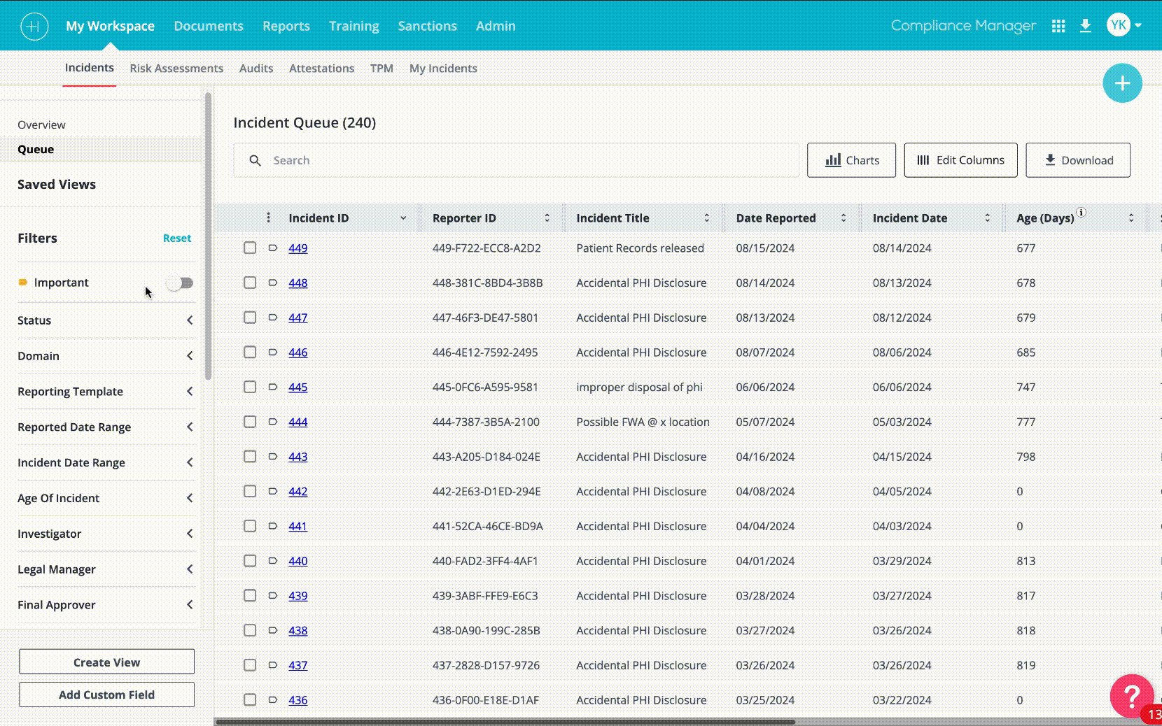
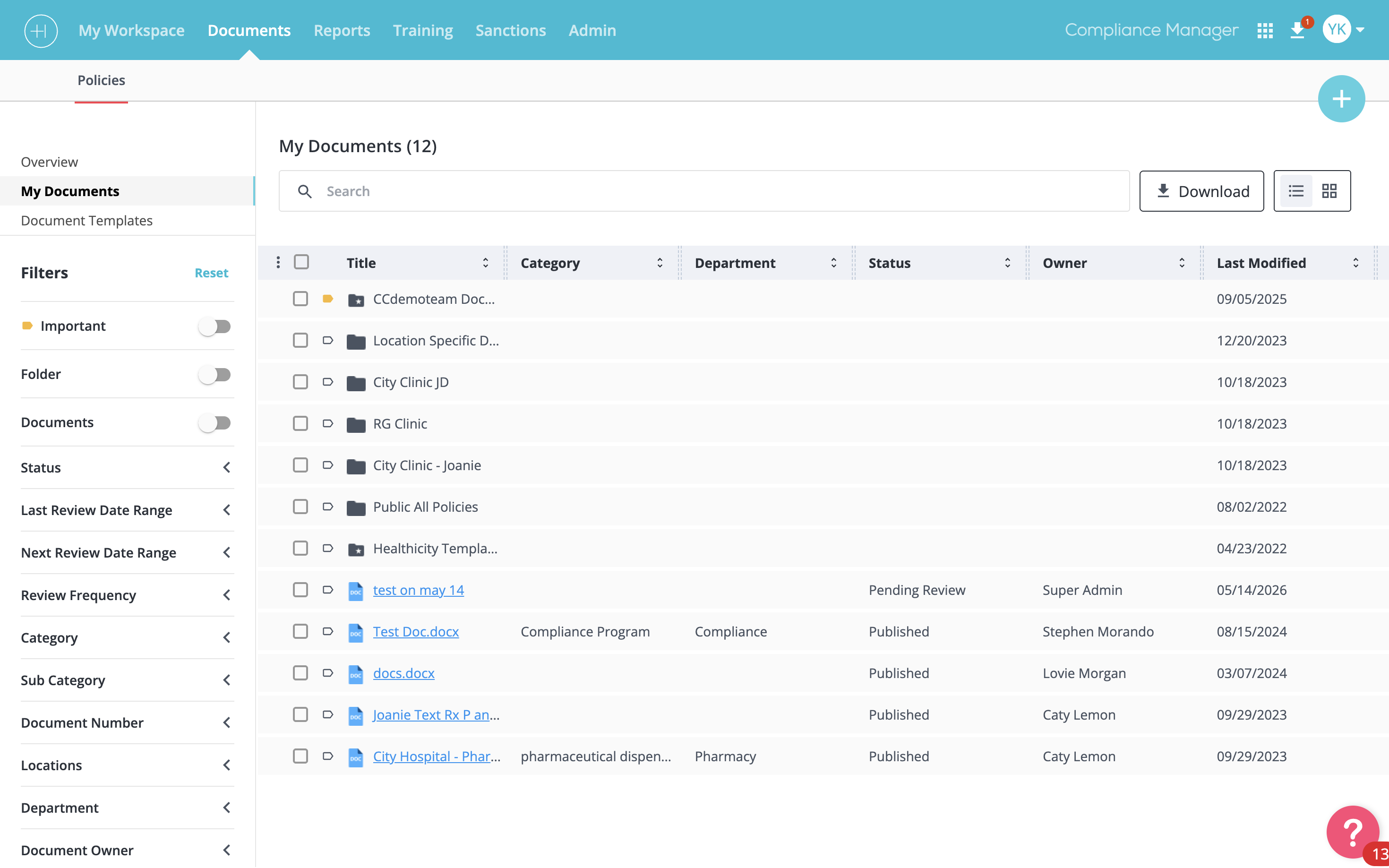
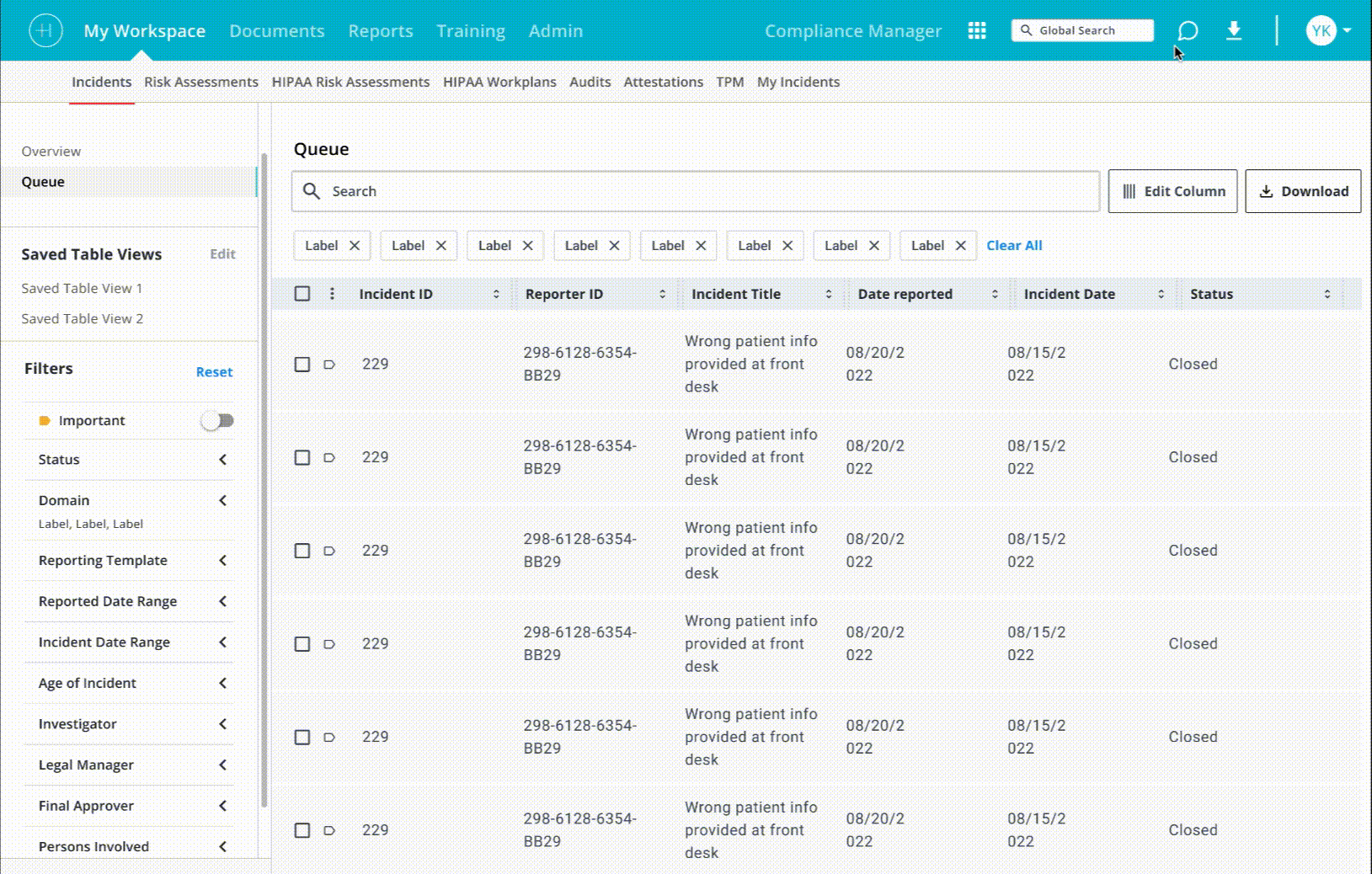
- Tables — the primary way users interact with compliance data — were slow to work with, hard to filter, and visually noisy
- Power users who lived in the product daily described repetitive filtering as "the most tedious part of my job"
What I found when I audited the product
After the feedback review I conducted a full UI audit — walking through every major section of Compliance Manager and documenting inconsistencies. What I found confirmed exactly what users were describing.
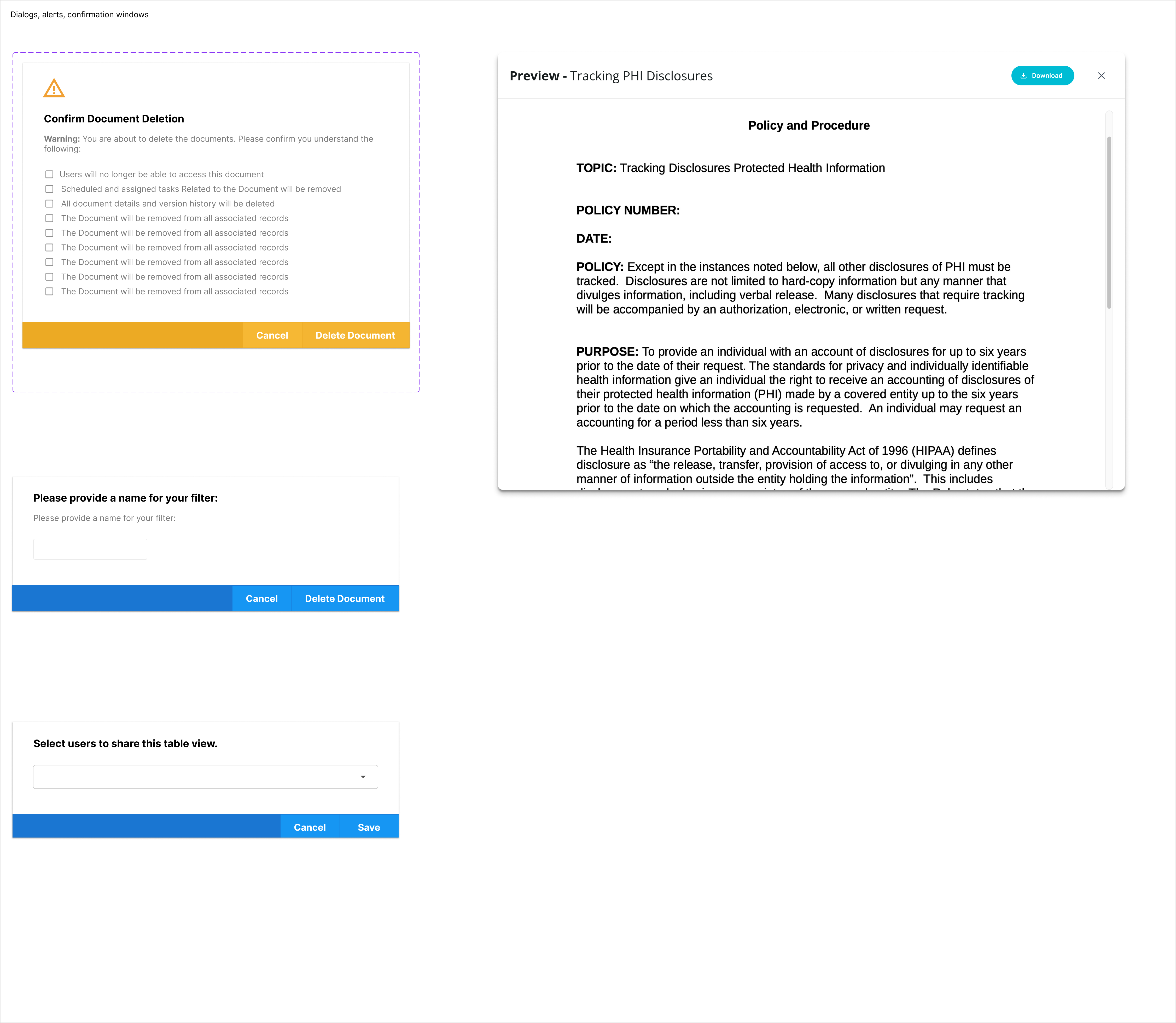
- 5+ different popup/modal styles used across the product, with no relationship to each other
- Tables with different header treatments, row heights, and column behaviors on different pages
- Buttons with inconsistent hover states — many had none at all
- Icon sets mixed from multiple sources, creating visual noise throughout
- Filter patterns ranging from hidden dropdowns to inline chips, with no consistent logic
- Colors applied outside the brand guide — particularly in data states and status indicators
The core problem was not any single broken feature. It was an absence of a shared design language. Without one, every new feature added more divergence, not less.
Why tables were the highest priority
Pendo analytics gave us clear direction on where to focus first. Tables accounted for the majority of user sessions and interaction time in Compliance Manager — they are the primary surface where compliance officers review incidents, track documents, and monitor policy status. If we were going to make the biggest impact with the least disruption, the table system was the right place to start.
Critically, improving the tables also required a component library to exist first. You cannot redesign a table system consistently across 20+ instances in a product without standardized tokens, states, and components. The two initiatives were always going to be sequential: build the system, then apply it at scale.
03 | My Role & Constraints
I was the sole designer on this product — no design team, no design lead above me. Every decision from discovery through to shipped code was mine to make, defend, and refine.
Real constraints I worked within
- The only design foundation I inherited was a brand PDF covering colors and typography. There were no Figma files, no component library, no documented patterns, no interaction standards, and no prior design decisions recorded anywhere. Everything beyond the brand PDF was built from scratch.
- Full redesigns were off the table — the product had active enterprise clients who would face retraining costs if the experience changed radically. New patterns had to feel familiar to existing users.
- Engineering bandwidth was limited — any component I built needed to be implementable without significant refactoring of the front-end codebase
- I needed to design and deliver simultaneously — there was no "design sprint" phase separate from delivery. Research, design, and iteration happened in parallel with engineering's shipping schedule
These constraints shaped my approach directly: instead of designing an ideal new system from scratch, I audited what was already working in the product and standardized those patterns first. Build on what exists, then evolve.
04 | Initiative 1 — Building the Component Library
Approach: standardize before you redesign
My philosophy for the component library was deliberately conservative: I was not going to design a beautiful system and then fight to get it implemented. I was going to find the best version of each pattern that already existed in the product and make that the standard.
This meant going through every page of Compliance Manager, identifying all the modal styles, table treatments, form elements, buttons, and navigation patterns — and for each one, asking: which existing version is the most usable, the most visually coherent, and the most feasible to apply consistently? That version became the component.
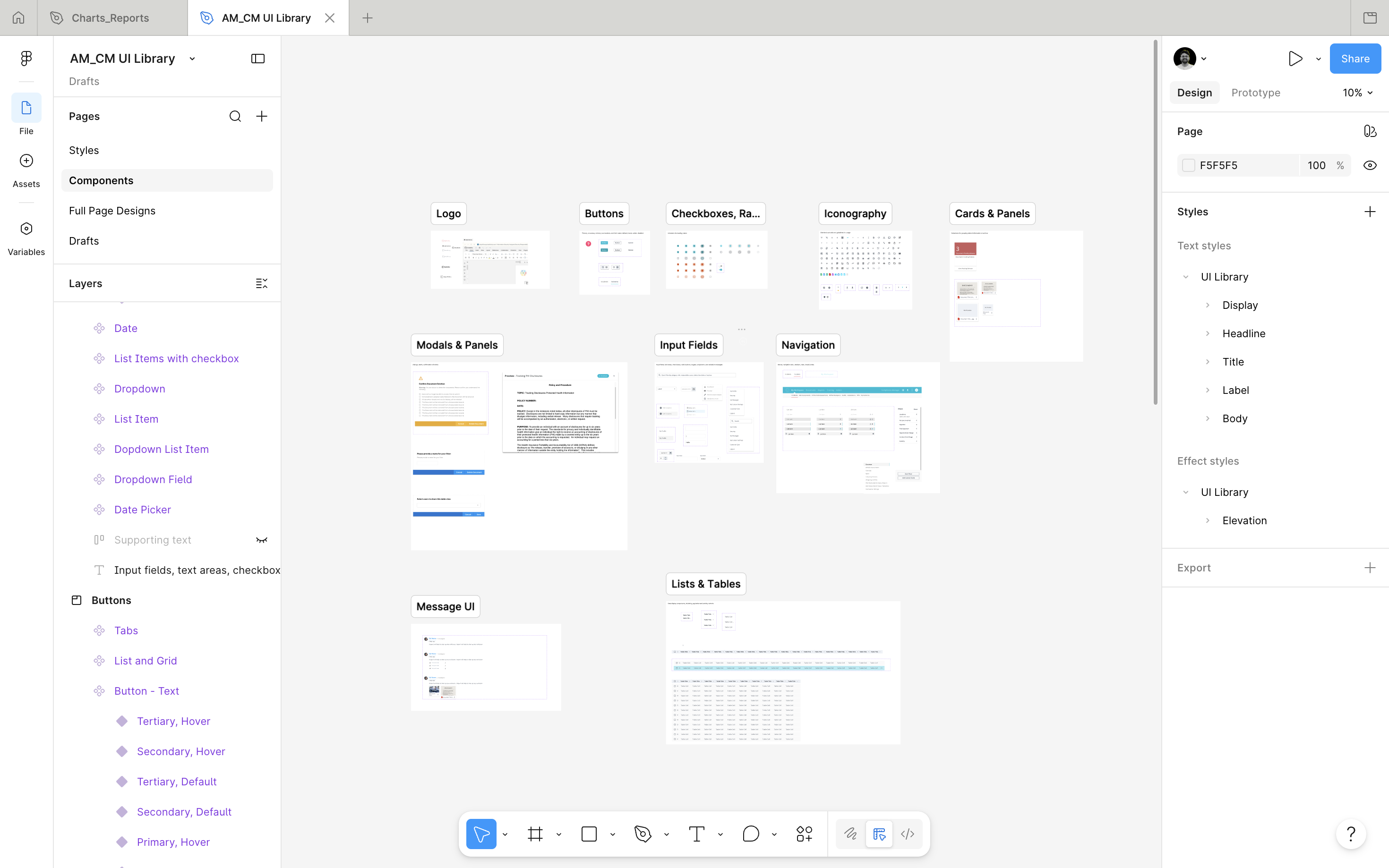
What the library covers
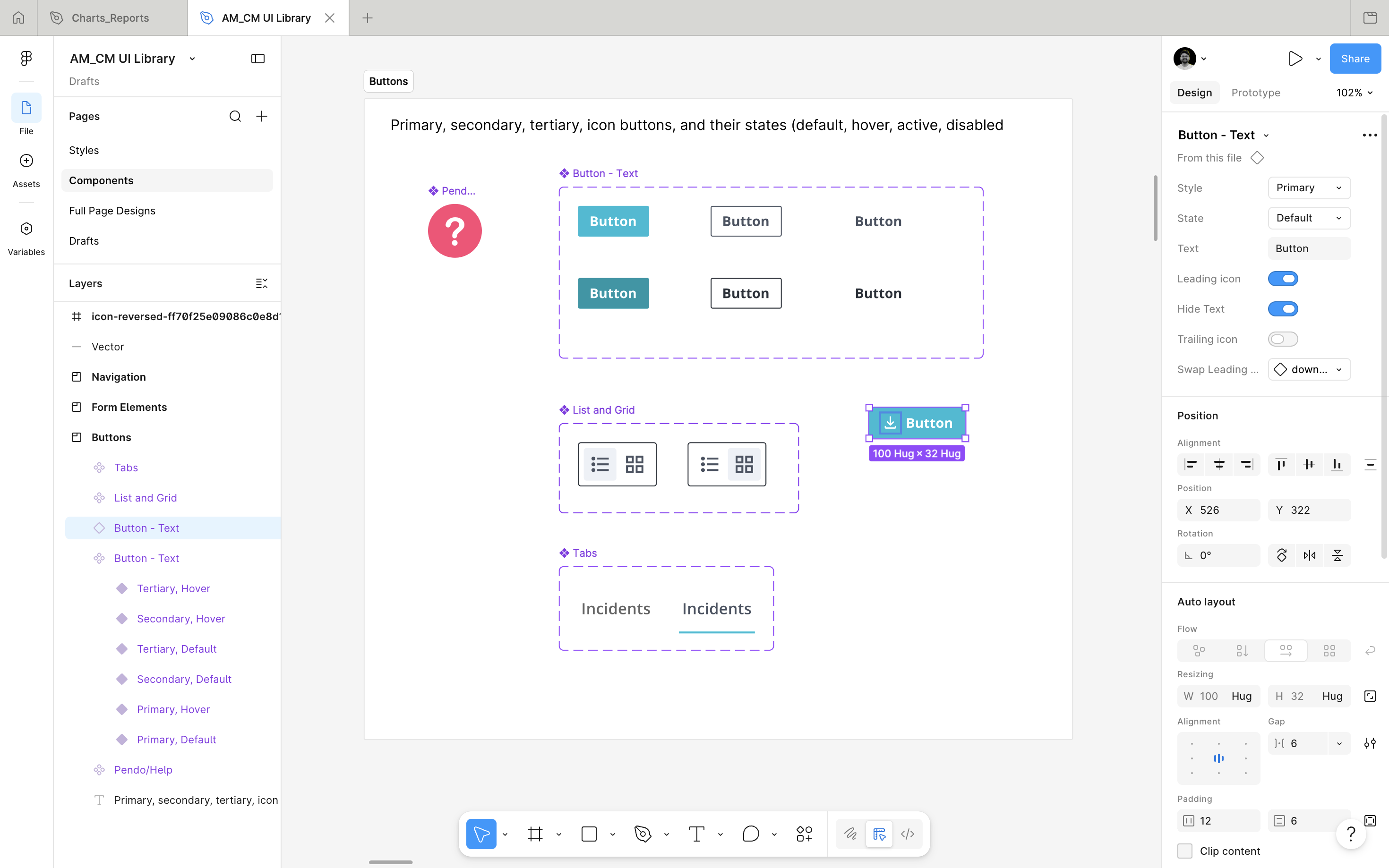
- Buttons — primary, secondary, destructive, icon-only, with documented hover, active, focus, and disabled states
- Tables — header rows, data rows, empty states, loading states, resizable column handles, row selection
- Modals and dialogs — standardized sizing (small/medium/large), header treatment, action footer, close behavior
- Form elements — text inputs, dropdowns, date pickers, checkboxes, toggles, all with validation states
- Filter components — the filter panel, individual filter chips, saved filter tab treatment
- Navigation — primary sidebar, breadcrumb pattern, section tabs, page-level navigation bar
- Status indicators — color-coded status badges using only brand-approved color tokens
- Data visualizations — chart component containers for the analytics module
- Icons — a curated, consistent icon set replacing the mixed sources used previously
Shared across two products
One decision that significantly increased the library's impact: I designed it to serve both Compliance Manager and Audit Manager, the company's second core product. Many enterprise clients use both. A shared component library meant that a user switching between the two products would encounter the same mental model, the same interaction patterns, the same visual language. That cross-product consistency had never existed before.
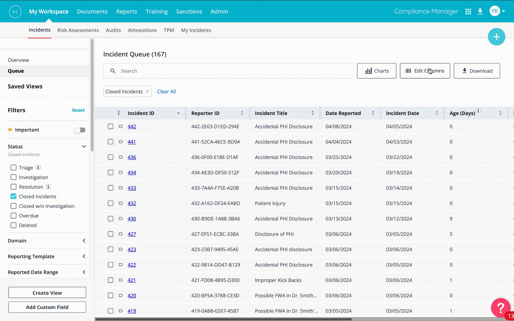
05 | Initiative 2 — The Table Redesign
Why the table needed a complete rethink
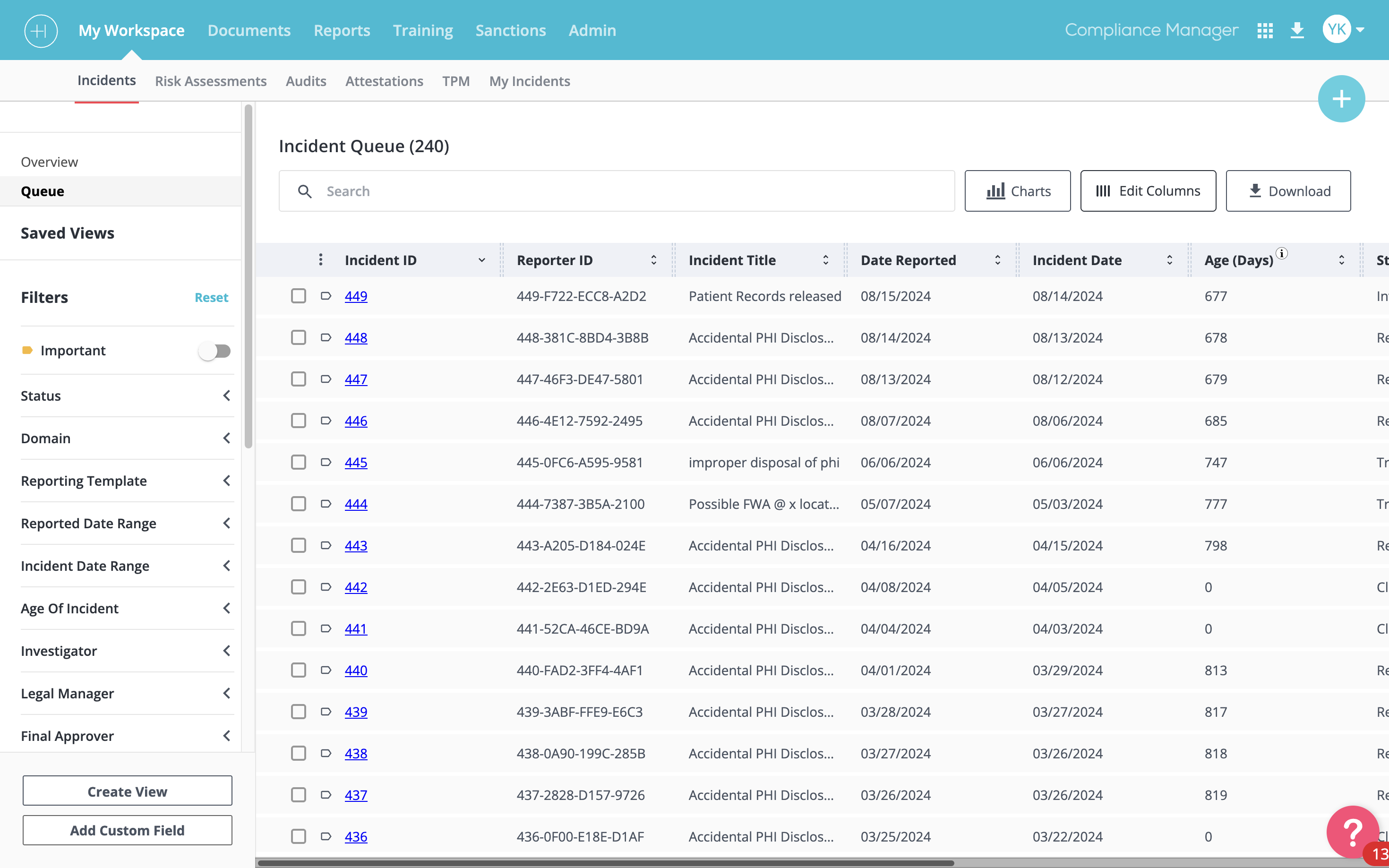
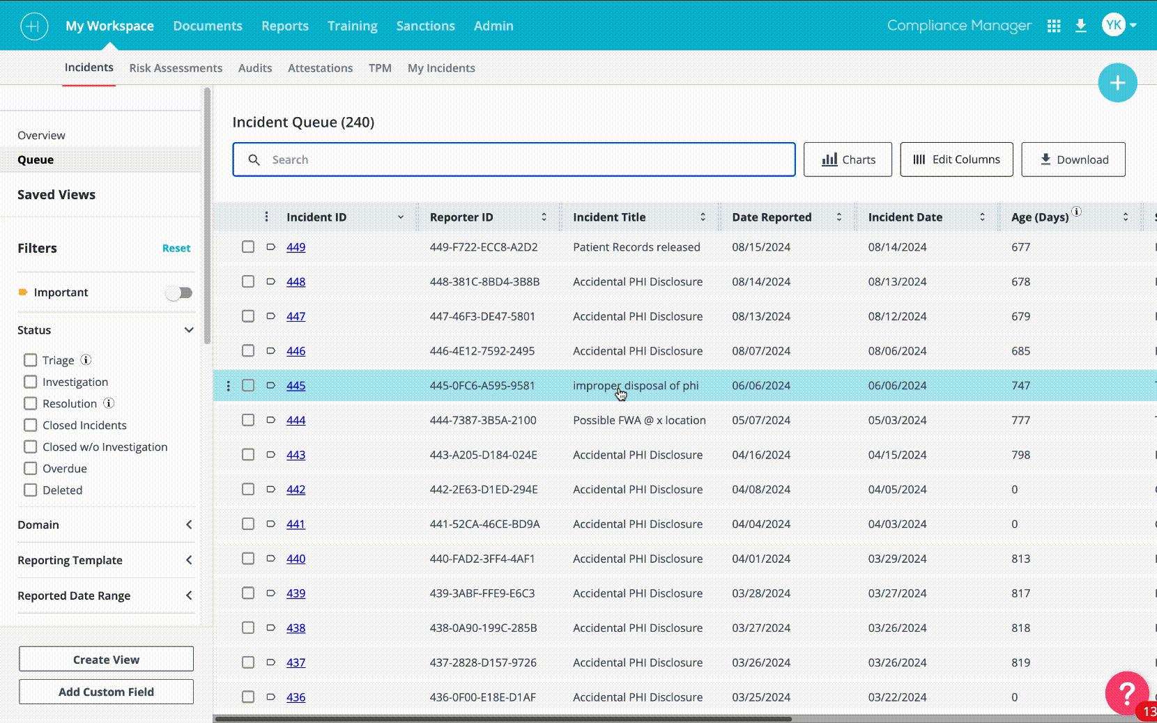
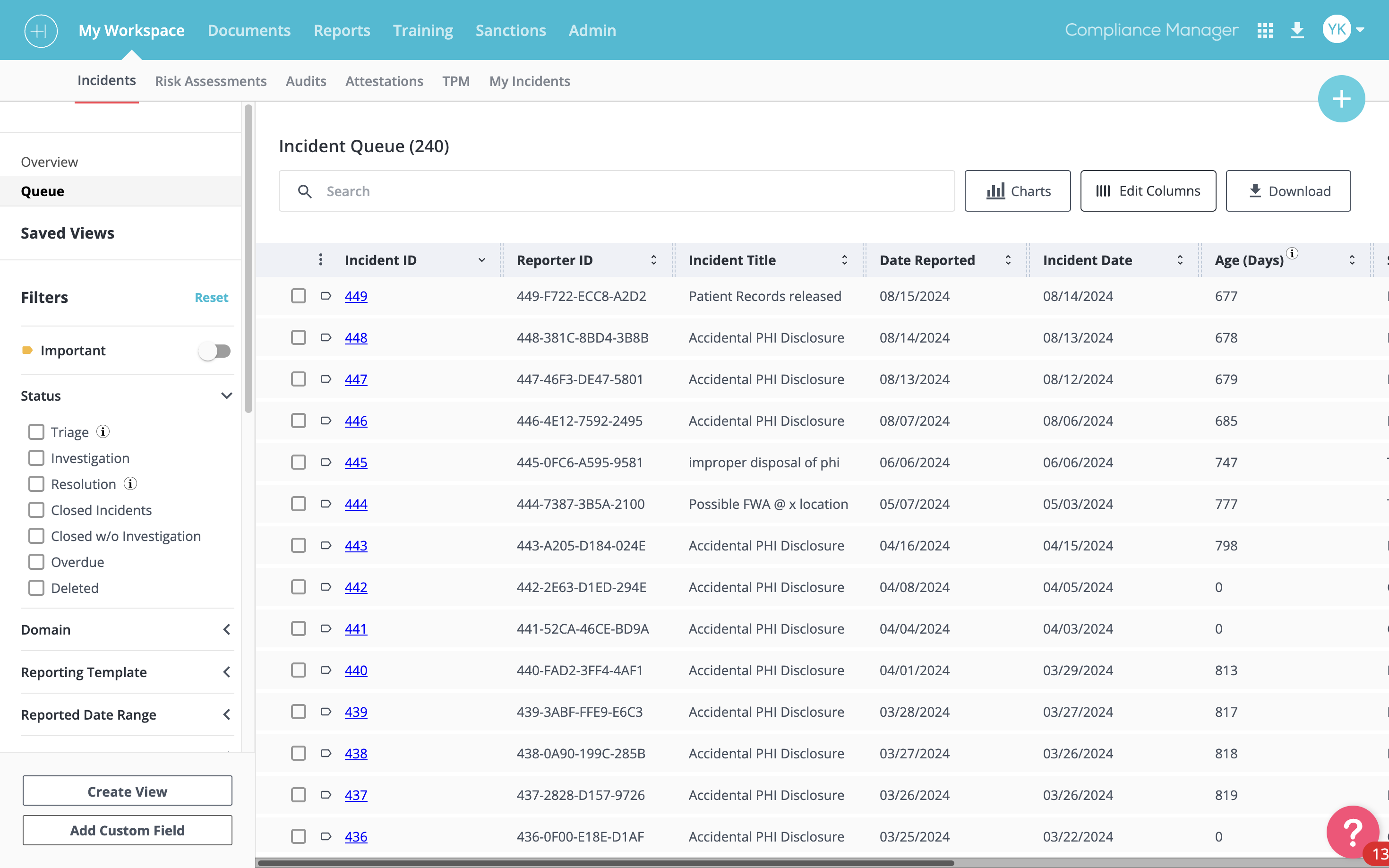
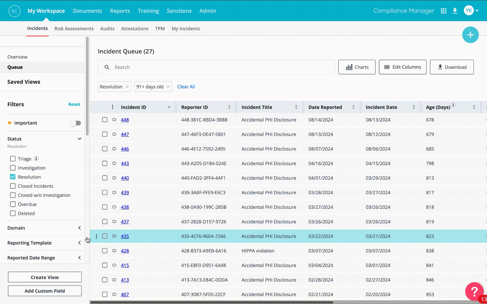
The existing table UI in Compliance Manager was functional at small scale — but compliance teams often work with hundreds of records, apply complex multi-parameter filters, and return to the same filtered views repeatedly throughout a working day. The original design handled none of this well.
- Pagination forced users to lose their place and reload the view to reach records further down the list
- Filters were hidden behind dropdowns that required multiple clicks to access and reset
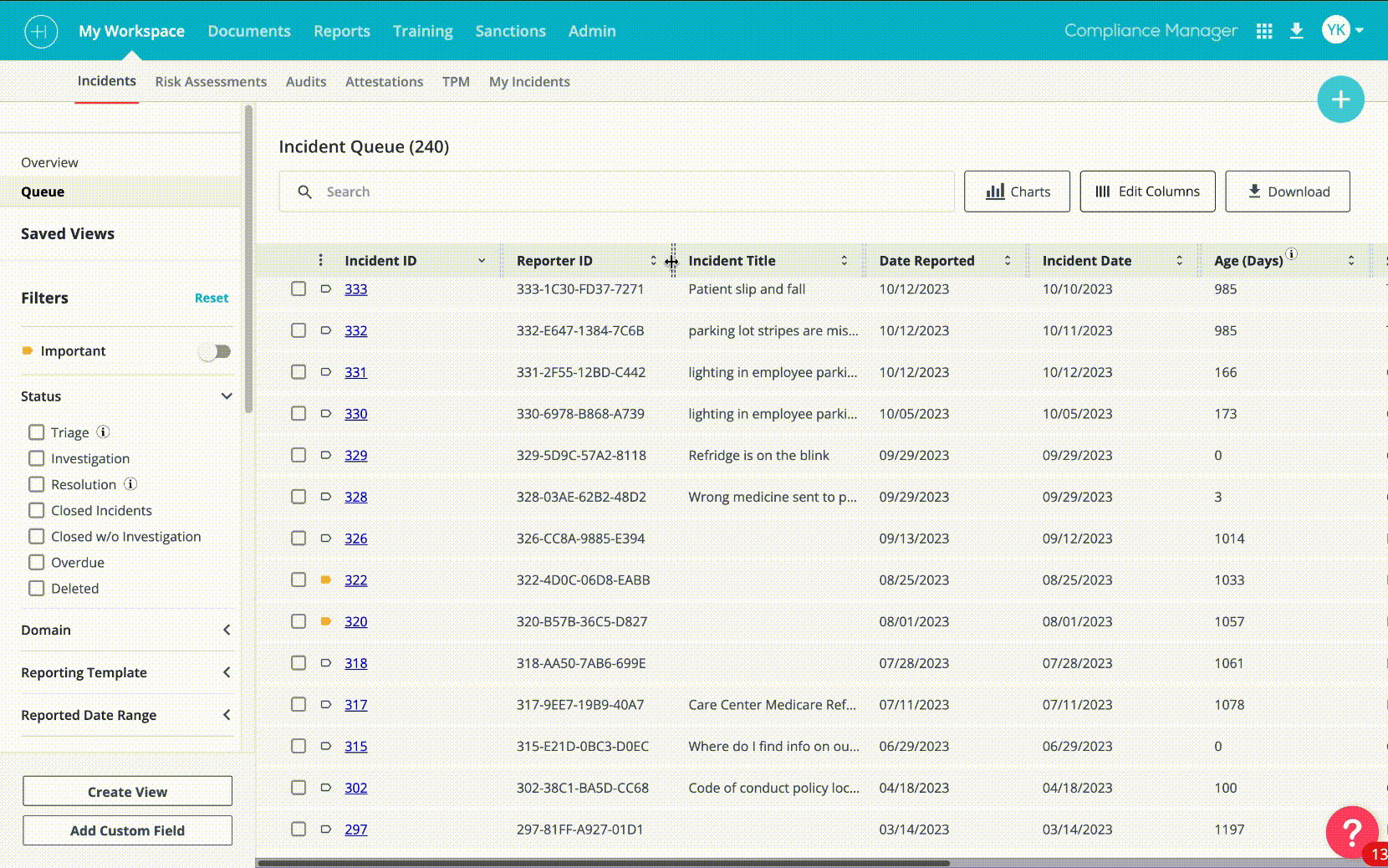
- Columns were fixed — users with different roles needed to see different data but had no way to customise their view
- There was no way to save a filter configuration, meaning power users rebuilt the same complex filters from scratch every single day
- The page felt static — no sense of where you were in the data, no analytics, no quick visual summary of what the filtered results showed
Infinite scroll replacing pagination
The single change with the most immediate user impact. Replacing the paginated table with infinite scroll meant users no longer lost their place when reviewing long lists. Records load continuously as the user scrolls, with a loading indicator that doesn't interrupt reading flow.
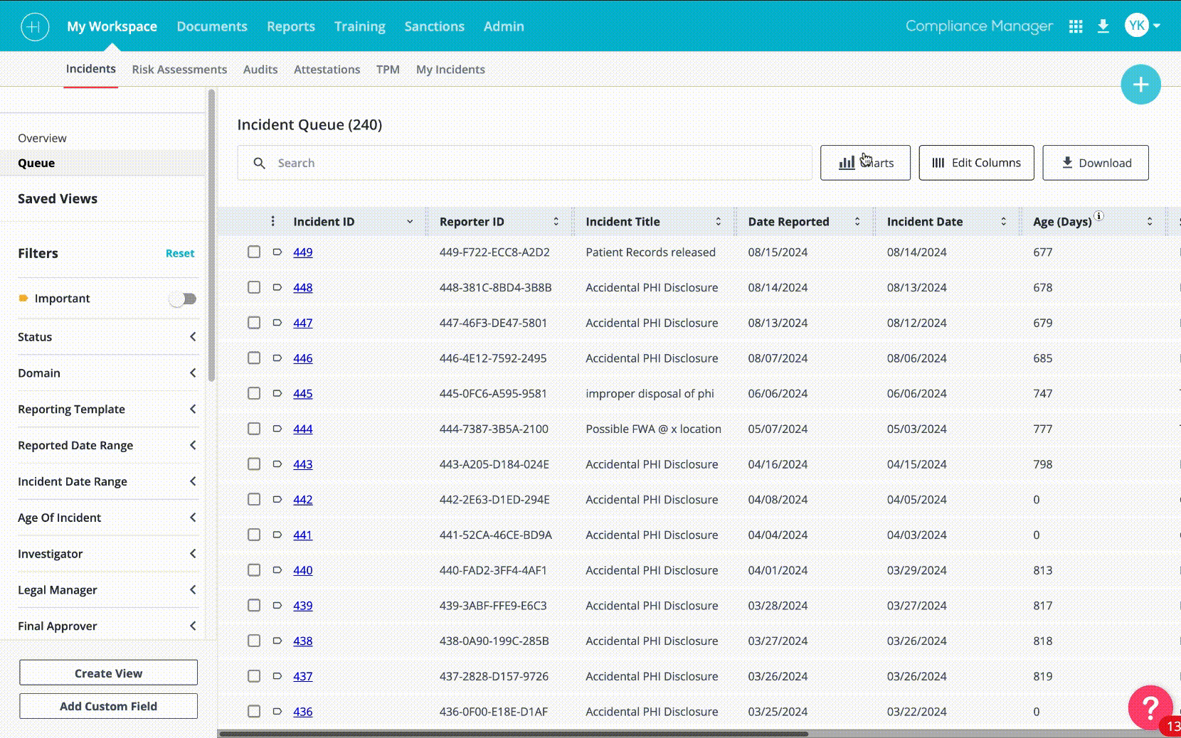
Left-side filter panel
Filters moved from hidden dropdowns scattered around the toolbar to a persistent panel on the left side of the table. This made the full filter set visible and accessible without obscuring the table content. Users could apply, adjust, and remove multiple filters simultaneously instead of sequentially.
Saved filter presets
This was arguably the most requested missing feature in the Pendo feedback. Users who run the same reports daily — for example, all open high-severity incidents from the current quarter — were rebuilding those filter configurations from scratch every session. Saved filters gave each user a personal set of presets that persist across sessions.
Each saved filter creates a new tab in the left sidebar, alongside the standard navigation. Users can name it, access it instantly, and manage their saved views from a dedicated panel. The implementation required close collaboration with engineering to tie filter state to user sessions — a non-trivial back-end task that I scoped and documented in the handoff specification.
Resizable and customizable columns
Different roles in compliance teams need different data visible at a glance. An investigator prioritizes incident severity and assignee. A policy manager prioritizes document expiry dates and review status. The redesigned table gave every user control over their column configuration — show, hide, and reorder columns via a right-side edit panel — with their preferences persisting between sessions.
Inline analytics and report charts
The most technically complex addition to the table system. When users apply filters, they often want to see a summary of what those filtered results look like in aggregate — not just a list. The inline analytics panel allows users to generate charts (bar, pie, line) directly from the current filtered data view, without navigating away to a separate reports section.
Users can switch chart types, change the color scheme, add or remove data series, and export the chart as an image or PDF. This was the feature I was most proud of — it transformed the table from a passive list into an active analysis tool.
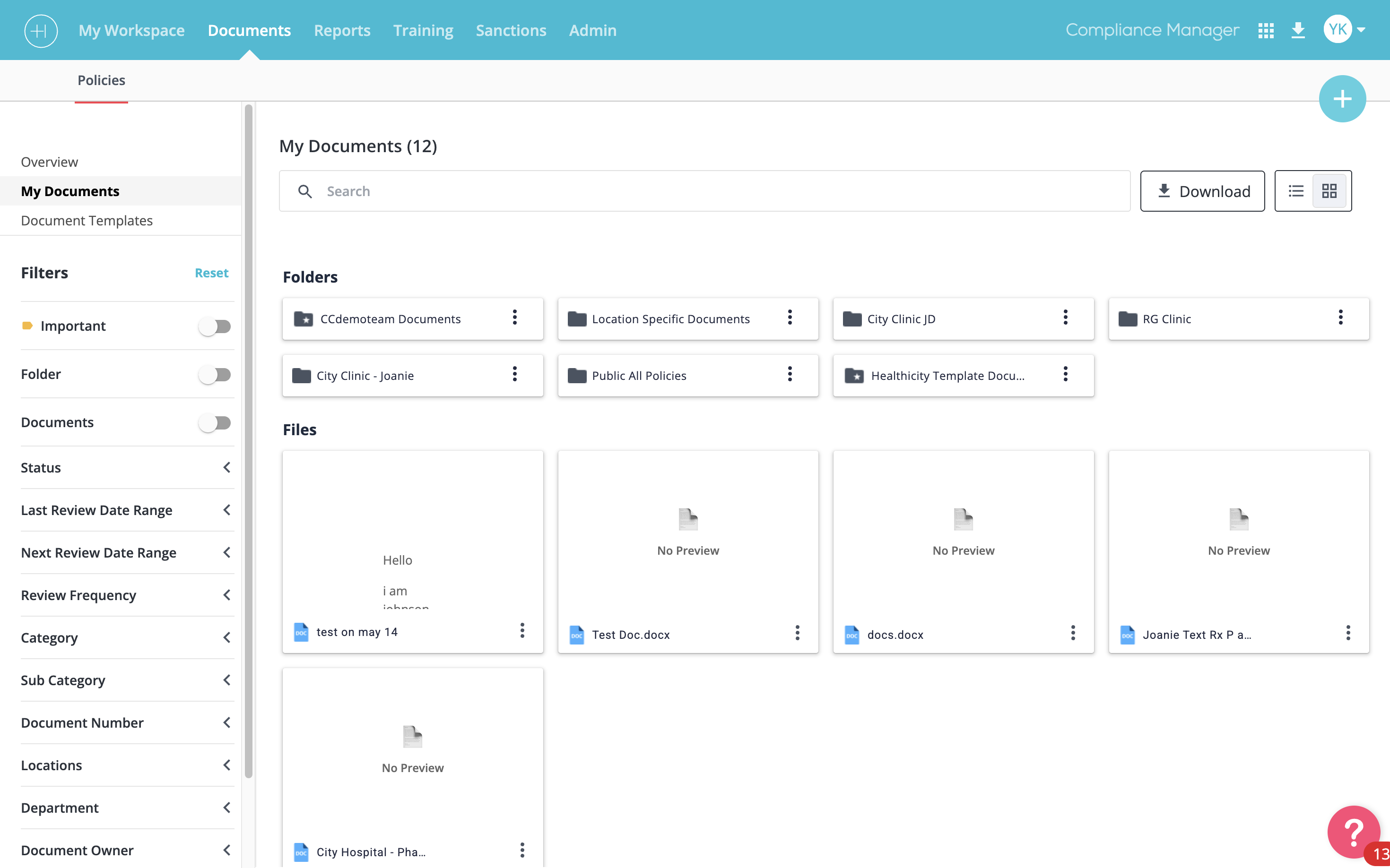
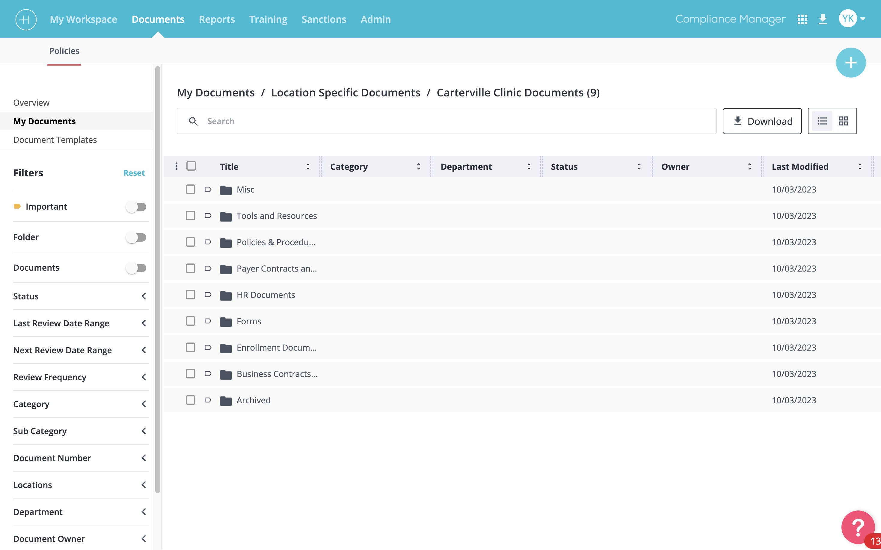
Document type recognition and grid/list toggle
The Documents section of Compliance Manager was updated separately to support the richer interaction model the table redesign established. Documents now display with file-type icons (PDF, Excel, Word, image) so users can distinguish document types at a glance without opening each one. A grid/list toggle — similar to Google Drive's folder view — lets users switch between a thumbnail grid for visual scanning and a dense list for bulk management.
Breadcrumb navigation
One of the most consistent pieces of feedback from user research was that users didn't know where they were in the product. Particularly in deeply nested incident or document views, the lack of navigation breadcrumbs meant users hit the browser back button repeatedly — sometimes losing changes in the process. We added a page-level breadcrumb with slash separators, allowing direct navigation to any ancestor page by clicking its label.
AI chatbot for compliance queries
In the later phase of the table redesign, we integrated an AI assistant into Compliance Manager. Users can open a chat interface within the product and ask natural-language questions about their compliance data — for example, "Show me all high-severity incidents from this quarter that are still open" or "How many documents are expiring in the next 30 days?" — and receive both a conversational answer and a direct link to the relevant filtered table view.
My design work on this covered the chat interface entry point (a persistent button in the main navigation bar at the top of the product), the conversation panel layout, the response format for data answers (table preview embedded in the chat), and the empty state and error handling for queries the AI couldn't fulfill.
06 | Design Process
Discovery
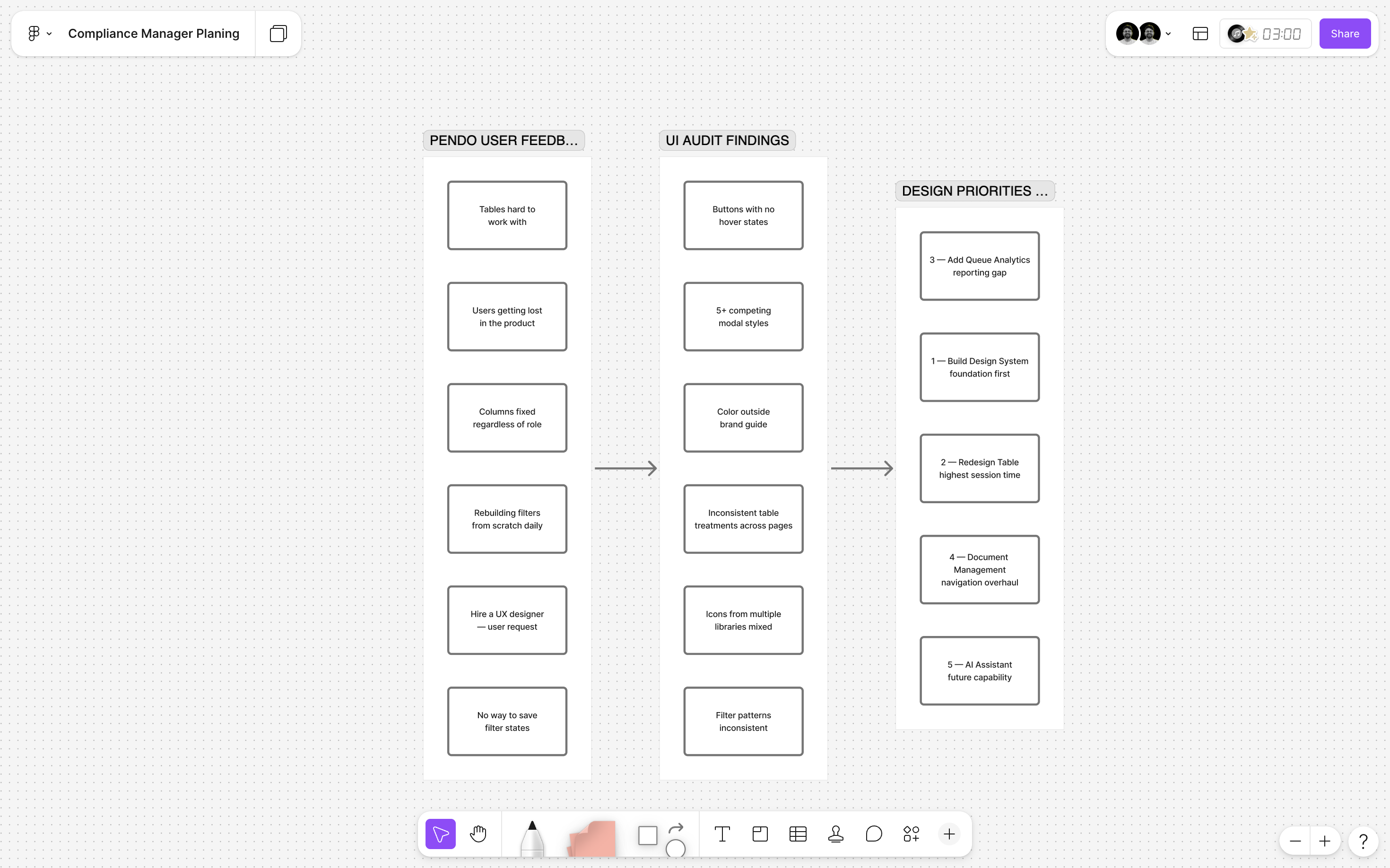
Every initiative started with a research pass — Pendo feedback and direct conversations with the US-based product managers who collected user input from enterprise clients. I kept a running FigJam board of friction points, requests, and observations organized by product area. This became my prioritization tool throughout the engagement.
Design and iteration
I worked in Figma exclusively — wireframes, component variants, high-fidelity mockups, and interaction specs all in the same file. Each major feature went through at least two review cycles with the product manager before moving to engineering: an early conceptual review (lo-fi or annotated wireframes) and a pre-handoff review (high-fidelity with interaction notes and edge cases documented).
For the table redesign, I tested key interaction questions — particularly around the filter panel position and the saved filter UX — by presenting options to the product manager with explicit trade-off documentation rather than just a recommended solution. This kept decision-making collaborative and gave me documented rationale for every significant design choice.
Handoff
I built detailed handoff specifications into the Figma Dev Mode annotations — redlines, spacing tokens, state documentation, and edge case notes for engineering. Given the remote, cross-timezone nature of the team (design in India, engineering leads in the US), clear written handoff documentation was critical. We had minimal live collaboration time, so every frame needed to be self-explanatory.
07 | Outcomes & Impact
Measuring impact at Healthicity relied primarily on Pendo analytics, product manager feedback from enterprise client calls, and internal team observation. Here is what we were able to attribute to these design initiatives.
Beyond the metrics: the shift in the user feedback tone visible in Pendo was notable. The requests to "hire a UX designer" disappeared. In their place were specific, constructive feature requests — the kind of feedback that only comes from users who feel the product is fundamentally working and are now focused on extending it. That qualitative shift was, to me, the most meaningful signal that the foundation work had landed.
"The new table is so much faster to work with. I can actually set up my filters once and come back to them." — Enterprise client feedback relayed by Product Manager after the saved filters feature shipped.
08 | Reflections
What I'm proud of
The component library. Not because it looks good in a Figma file — but because it genuinely changed how the team operated. For the first time, product managers could reference a shared visual language when writing feature specs. Engineers knew what "use the standard table" meant. Reviewers could give design feedback anchored to consistent patterns rather than personal preference. The library quietly improved every part of the design and development process, not just the UI it directly shaped.
What I would do differently
I would instrument the impact measurement better from the start. The 30% and 15% figures came from Pendo analytics that were already in place, but I didn't set specific baseline measurements before the component library work began. That made it harder to attribute improvements with precision. In future system-level work I'd define metric baselines explicitly before touching the design.
I'd also push harder for user testing sessions with actual compliance officers — not just product manager relays of client feedback. The Pendo data told us what users did; direct sessions would have told us more clearly why. Given the remote nature of the team and US-based client base, organizing this was a real logistical challenge, but it's something I'd invest more effort in.
What this taught me about designing systems
The most important lesson: a design system is not a deliverable, it's a decision-making tool. The component library was not the endpoint — it was what made everything else possible. Every time I designed a new feature for Compliance Manager after the library existed, I was making design decisions in a fraction of the time, because the foundational questions (what does a button look like? how does a modal behave?) were already answered. That compounding value is what makes systems work genuinely different from feature design work.
09 | More From This Project
This case study covers the component library and table redesign. Other significant projects I led at Healthicity that are documented separately:
- Incident Management Redesign — AI-generated incident summaries, two-way anonymous communication, voice call transcription integration, and white-labeled public reporting portal
- Data Breach Risk Assessment — multi-step risk assessment wizard with dynamic scoring and final result calculation
- Drag-and-Drop File Upload — multi-file uploader deployed across 20+ form contexts in Compliance Manager, replacing single-file selection throughout the product
Explore More Projects
Check out some of my other recent design work on Behance
PhonePe — Making Spending Smarter
Designed an Expense Manager feature for PhonePe's UPI platform — helping users track spending and make smarter financial decisions.
View on BehanceFinIQ — Personal Finance App
End-to-end UX/UI design for a personal finance management mobile app.
View on BehanceDisha Jyoti
UX design for a mentorship platform connecting students with industry professionals.
View on Behance